
Embracing opportunity to launch this innovative eyewear brand into a new market.
Mission
Create a supplemental website for Warby Parker that connects customers and their optometrists because there is a gap between getting frames and prescription lenses all in one shot.
The supplemental website I devised, Warby Optical, establishes a new way to gain and keep customers by simplifying the process of finding an eye doctor, getting new prescriptions for glasses, scheduling online, and much more with the end goal of making these tasks seamless with the users’ shopping experience and garnering customers in a new market.
User Experience
“All I want is to be able to see. I want my glasses fast and easy.”

Patient persona, Matt
“My patients are my number one priority, but I want to be more effective in providing care.”

Optometrist persona, Dr. Edna
Diving in with three user personas given to me by the client, two patients and one optometrist, I identified several pain points.
- Time
- Lack of information on optometrists
- Confusing navigation
- Difficulty scheduling appointments
- Outdated processes
- Patient information overload
To solve these user issues I wanted to introduce critical features such as a communication portal, email and text notifications, and a simple scheduling function as part of the MVP.
Discovery + Research
Through competitive analysis, I identified opportunities in the market where Warby Parker could position itself strongly as they wanted to bridge the gap between customers and optometrists. Most major competitors like BonLook and Made Eyewear have the ability to enter in prescriptions and send out new glasses, but only LensCrafters uses eye doctors as a part of their business model, they are also the only company on this list to accept insurance.

Competitive analysis spreadsheet
Open card sorting was a helpful tool here, validating the major categories such as “Doctors,” “Insurance,” “Checkout,” “Consult a Doctor,” and “Personalize.” To narrow down the scope, I designed the “Doctor/Patient” and “Find a Doctor” categories.
Design Process
With that, I broke this down into a 2-pronged site map, focusing on the user experience from both personas, Matt and Dr. Etna.

Warby Optical site map
The Warby Parker brand is strong, sleek, modern and instills innovation. I worked to capture the sleek and streamlined page layout from the parent site, focusing on the consistency of repetition and alignment as key components for Warby Optical. Below is the first iteration of my design, a wireflow following the path of a patient.

Sketch of first iteration wireframes
Below is a second iteration of the schedule with more detail and updates from user testing, such as bringing the two arrows on the calendar together for easy clicking through the week’s schedule. On the bottom right, I’ve also created a schedule overlap to symbolize a calendar conflict. Once a patient schedules an appointment and the time conflicts with an appointment on the doctor’s personal calendar, the doctor and the patient both receive an alert pop up to remedy the issue.
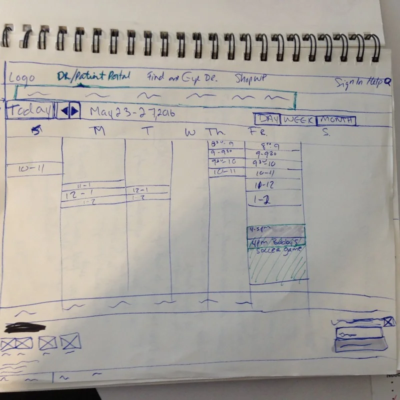
Sketch of 2nd iteration wireframe of a calendar
Prototyping + Usability Testing
Based on research and user personas, I used Axure to create a clickable prototype to show the interactions designed to solve the pain points, creating a fast and easy process for both doctors and patients. I also wanted to show where there are opportunities for expansion and marketing within the Warby Parker brand.
I had several users test this prototype, both previous Warby Parker customers and potential new users. I learned that some pages were cluttered and sometimes buttons were placed out of the main sightline so I iterated on this feedback Through usability testing I also learned that the document upload page was confusing and needed more options, the distance radius on the “Find a Doctor” page needed to be clarified and instead of an open text field, I swapped in a drop down with several mile-radius options for ease of the user experience.

Prototype snapshot of “Find a Doctor” search page

Prototype snapshot of “Doctors Near My Location” page

Prototype snapshot of Health Summary page inside patient portal
Check out the prototype demo below following the user flow for “Matt,” a user who wants to schedule an appointment, message his doctor with a question, and upload his insurance. Once he has a new prescription, he can checkout on his Health Summary page with a one-click checkout feature.
Results
I solved for Warby Parker’s goal of connecting customers with their optometrists, designing a website where there is fast and easy access and options to turn lengthy errands into a simple 5-click process. I also incorporated a one-click checkout process for returning customers if they’re interested in buying the same pair of glasses with an updated prescription.
Thinking about the future, a mobile app will be ideal. In this day and age we’re only moving toward a more mobile lifestyle and being able to do “errands” on the fly or even while sitting in the comfort of your home is becoming the standard. We would also incorporate a function to take pictures of insurance cards and other documents and upload them, similar to how we can deposit checks to our bank via cell phones.

Presenting slides for pitch
Lessons Learned
This was my second project delving into the user experience design realm. In hindsight, I see that I did competitive analysis on the commercial side of the business, even though I wanted to focus my scope on the expansion portion by building a doctor/patient portal. I started designing from scratch and didn't have a real sense of convention for this market.
Mid-project, I was forced to pivot my designs completely because I had missed the mark.
I reviewed a patient portal and several online calendars to get amore accurate sense of what was conventional and proceeded from there. Luckily, I realized that I was going in the wrong direction — or in fact, I was going in 10 directions. It was tough trashing my original game plan, but absolutely worth it in the end to come up with a design that was user-friendly.